London is one of the world’s great cities. With that comes unique challenges and opportunities. We worked with the Centre for London to create an essay series that explores some of the key issues impacting the capital.
What are the main challenges that London faces today? How do these impact how we live, work and play in the capital? And how can we tackle them?
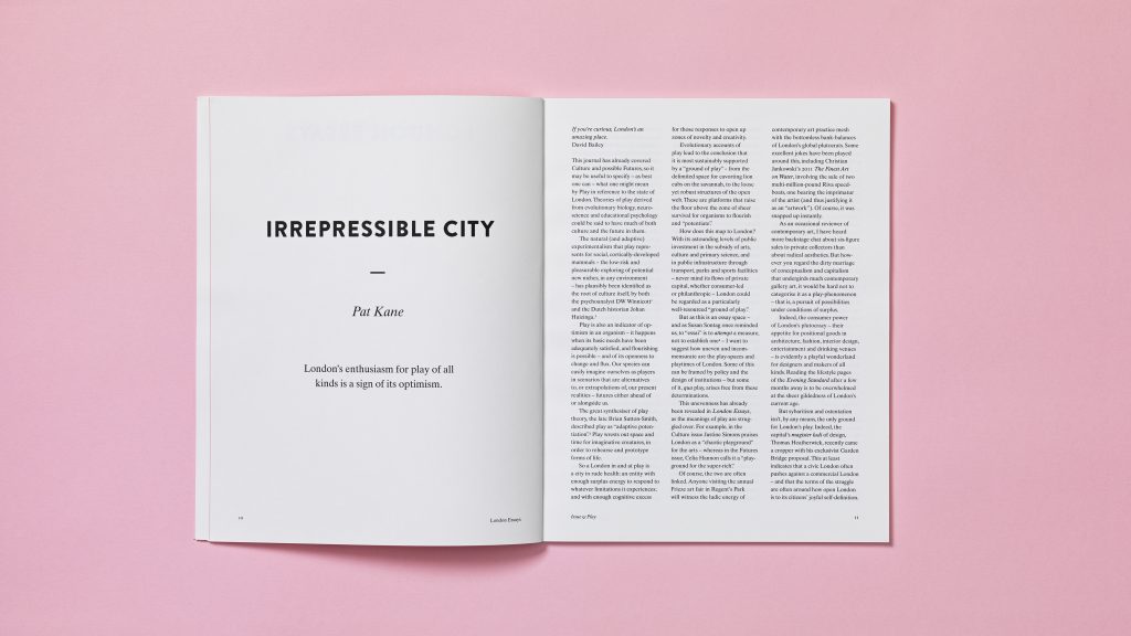
London Essays is a landmark series that sets out to answer these big questions. Produced by the Centre for London, a think tank dedicated entirely to the UK capital, each issue is based around a single theme and features contributors from a range of disciplines.
We worked closely with the Centre to create a visual language, publication design and online home for their new series; something that reflected the powerful ideas and perspectives contained within it.
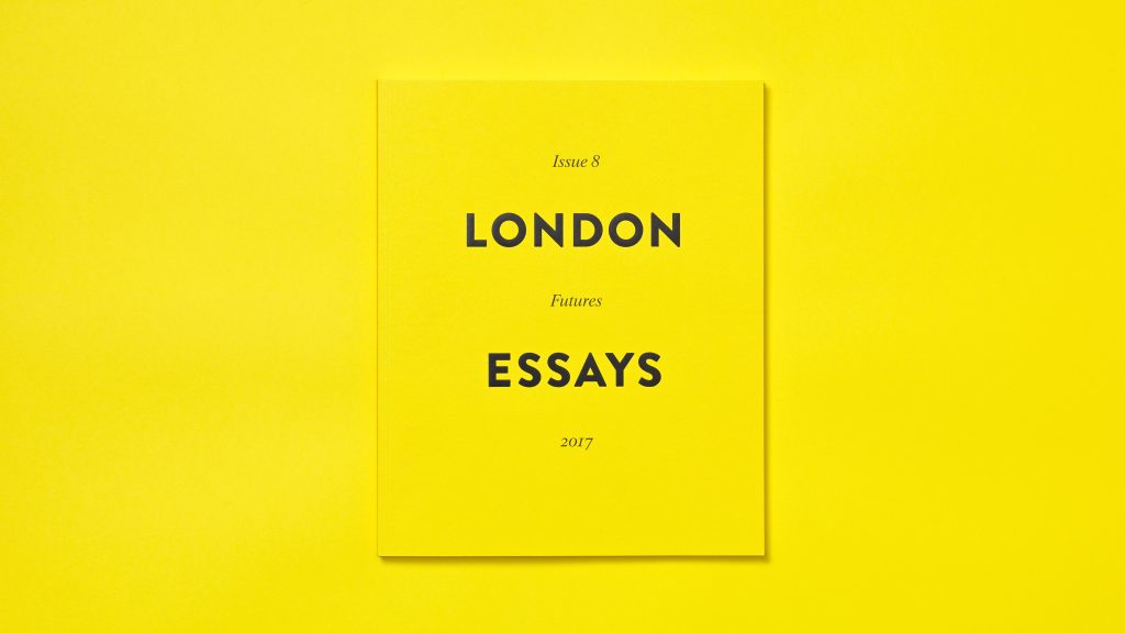
A big consideration for us was how to create a harmonious experience across both print and online. The series needed to have a visual voice that was ambitious, fresh and authoritative. It needed to have that ‘London feel’ without being obvious. We settled on a bold, typography-led design that captures the essence of Edward Johnston’s iconic Underground type.
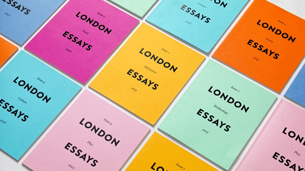
The journal is restrained in its overall approach and we have kept a consistent design that works across multiple issues of the journal. Playful colours are used to signpost different issues, keeping the design fresh and giving the reader an element of surprise. With continuity between print and web in mind, we selected a colour from the GF Smith Colorplan paper range for each print edition that works equally well on screen.
We were especially pleased at how seamlessly the design integrated across print and digital. The design continues to inform our thinking about how we present our research and ideas.
Jo Corfield, Centre for London
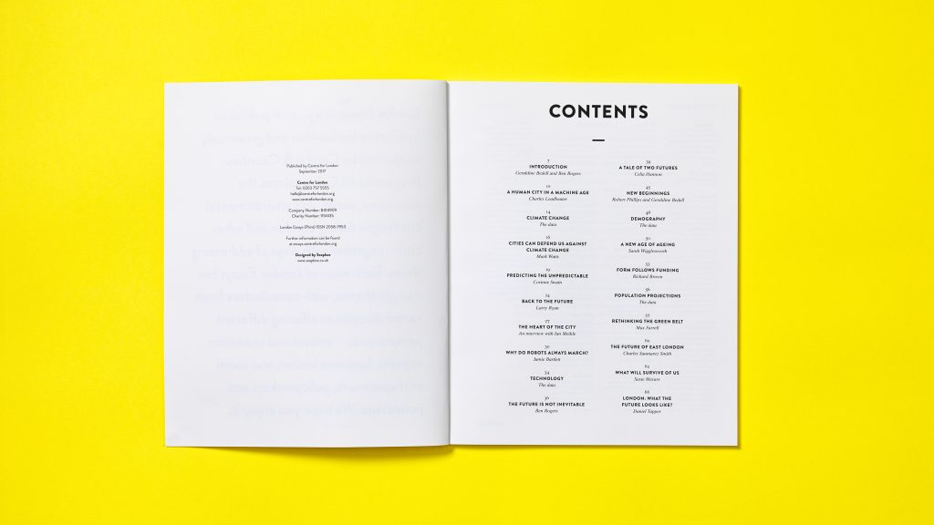
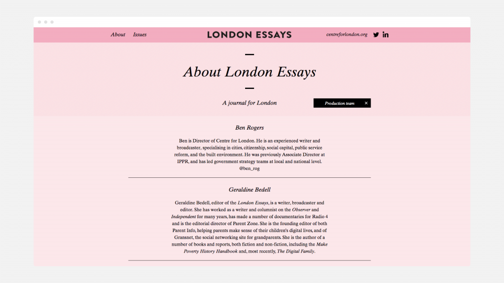
The minimal typographic approach ensures the writing remains the main focus, and our understated design puts the content at the heart of the reader’s experience. Readers can engage quickly and easily, without distraction, both online and in print.
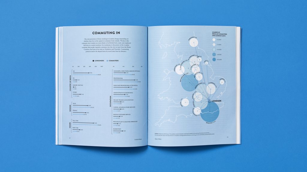
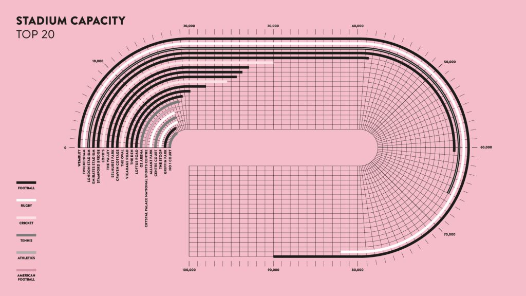
Data visualisation is a core part of the journal. Each issue has three feature infographics which break up the more classic essay layouts. Working together with the Centre’s researchers, we selected compelling stories that could be translated into custom visualisations.
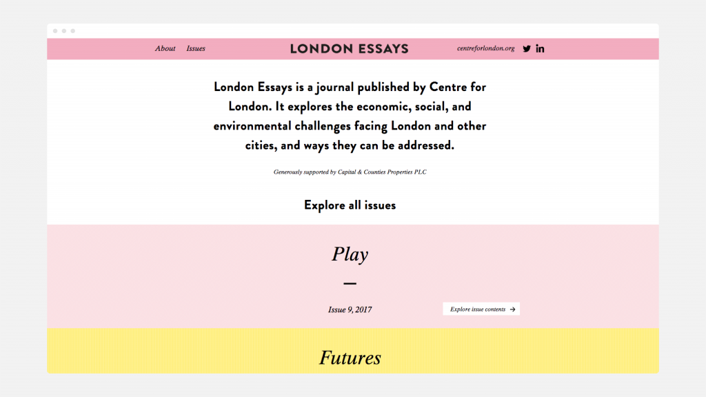
Though some of the qualities of print – such as the tactile nature of paper and the foil blocked type on the cover – cannot be replicated online, the website is designed to maximise the capabilities of the digital space. The landing page of the website is an expanded contents list where each link leads to a new essay.
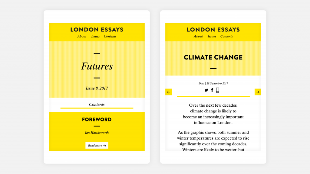
Sticky ‘previous’ and ‘next’ buttons make it easy to flick to adjacent articles, evoking the feeling of leafing through the bound print book. And the colour scheme of each issue is carried through online, offering a unified experience across print and digital – and a space to reflect on the issues determining the future of London.