The UK has three highly respected think tanks that focus on improving the country’s health and social care systems. One of these – the Nuffield Trust – asked us to redevelop its website and identity to help it to stand out from its peers.
With a new strategy in place, the Nuffield Trust had an ambition to broaden its communications activities. It particularly wanted to work more closely with practitioners and managers inside the healthcare system. At the same time, it wanted to maintain and improve its contacts with more established policy and media audiences. To help with this, the Trust invited us to overhaul its identity and rebuild its organisational website in ways that would encourage action and engagement.
We kicked off the project with a high-speed version of our branding discovery process. We ran a series of co-creation sessions with a team from the Trust to deepen our understanding of their needs and get a sense of what made the organisation tick.
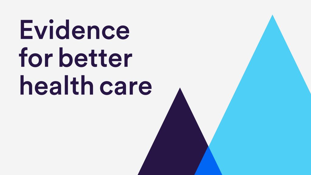
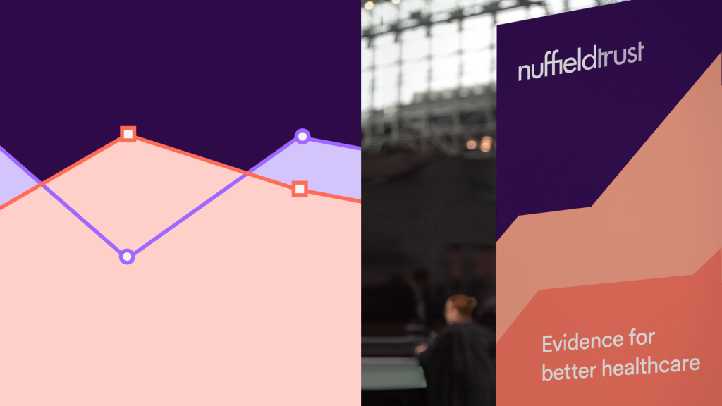
What emerged from that process was one clear area of focus: data. This became the basis of the visual identity, symbolising the Trust’s commitment to rigorous research, evidence and analysis, and supporting its positioning as robust and analytical.
With the foundation agreed, we set about creating a flexible and digital-first identity system to sit alongside the existing logo. Bold, colourful geometric shapes sit at the heart of the graphic language, including peaks, lines and patterns inspired by actual data visualisations produced by Nuffield Trust researchers.
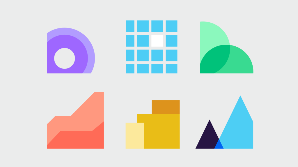

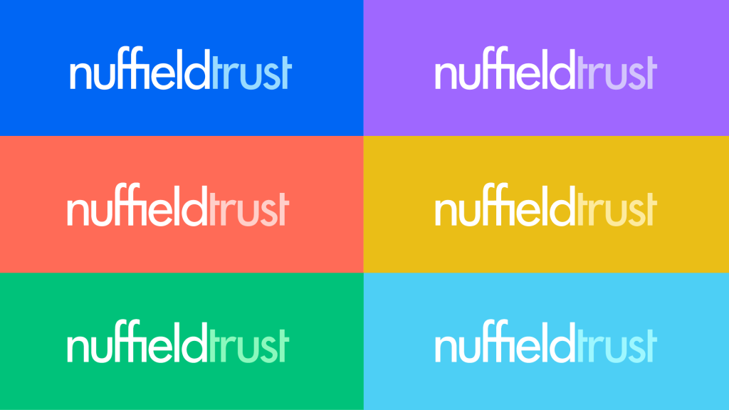
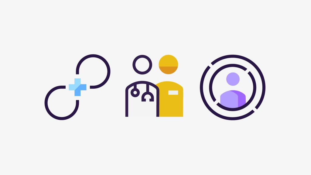
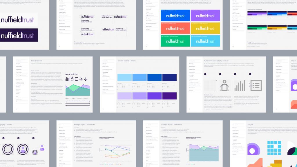
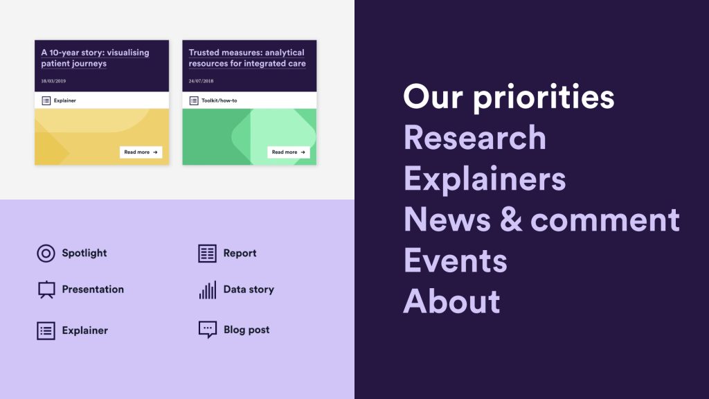
To bring consistency across print and digital we considered all aspects of the visual system, including a colour approach that met onscreen accessibility requirements. A gallery of custom icons together with a bespoke data visualisation style ensures that every chart and infographic, both on and offline, feels distinctive to the Nuffield Trust.
Of particular importance was an easy-to-use and impactful suite of publication templates that we created to accommodate different types of content. This, coupled with a set of comprehensive brand guidelines, provides a consistency and coherence that had previously been lacking.
The Nuffield Trust’s most important communications platform is, of course, its website. We knew we would need to revise its design to reflect the updated visual identity. At the same, we took inspiration from a 2015 article by Washington DC-based communications strategist Mike Connery on The Digital Think Tank to pursue something much more ambitious.
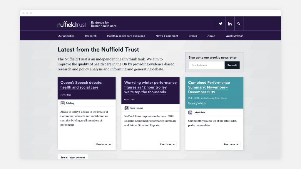
Our aim was to create a truly modular website; all pieces of content are broken down into their smallest self-contained elements. Each data visualisation or graphic is given its own page, alongside more conventional content types, like blog posts and publications. These content items are building blocks that can be combined and presented in various ways to create unique syntheses and engaging narratives, reflecting the full breadth of the organisation’s knowledge and ideas.
Each content building block can be accessed and shared independently. And if, for example, the data in a chart needs to be updated, the change only needs to be made once to the original item – it is automatically applied to every blog post or publication item in which that chart has been embedded.
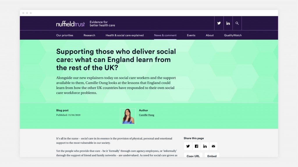
The new design system works seamlessly online, from abstract shapes and pops of colour to the functional iconography and the typographic hierarchies.
We integrated the interactive data visualisation tool Everviz into the CMS so that Nuffield Trust styling can be applied automatically to charts presented on the website. As well as offering interactivity, Everviz allows users to download the underlying data, share the visualisation easily and even embed it (with attribution to the Nuffield Trust) on their own website.
Since the site was launched, the Nuffield Trust has taken a continuous improvement approach, reviewing its performance and making important technical, design and content updates as needed. For example, when the funding for QualityWatch – an initiative jointly run with another health think tank – came to an end, we were able to integrate its content seamlessly into the website, while also retaining a distinct QualityWatch sub-brand.