Founded in 1945, the United Nations Association of the UK is a grassroots membership organisation working to build a better world through an effective UN. We are proud to have worked for over a decade constantly improving their member magazine.
UNA-UK is a national organisation with over 20,000 members, and is the only UK charity dedicated to building support for the UN amongst policy-makers, influencers and the public. Soapbox have a long-established relationship with UNA-UK, and for many years we have worked with the organisation on its flagship publication, New World magazine.
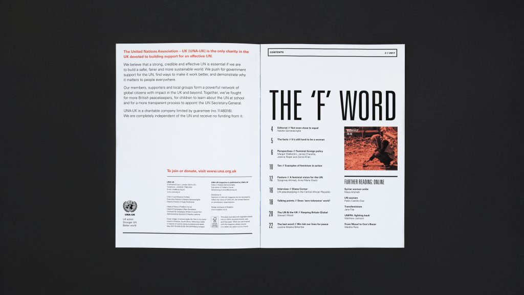
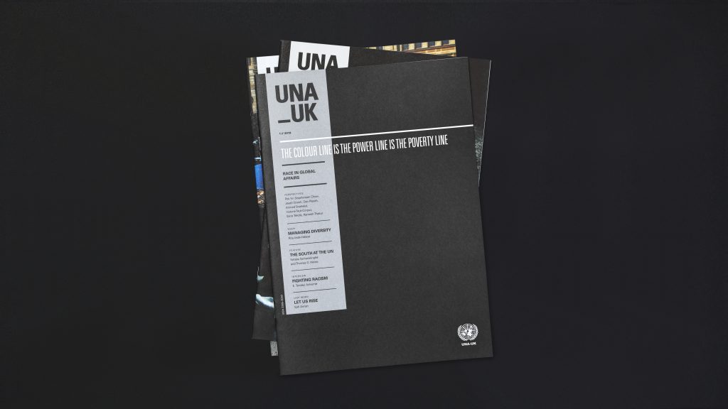
In 2017, UNA-UK came to us with a new brief – to develop a fresh look for the magazine. With plans to rename New World as simply UNA-UK, the redesign needed to mark this transition and shift the publication in a more serious, journalistic direction, on par with the current affairs titles that its audiences would also be reading.

Working side-by-side with UNA-UK’s Executive Director, Natalie Samarasinghe, we developed a visual language that is assertive, pared-down and powerful. Working from the outside in, the new cover design sets the tone for the entire magazine – and creates a distinctive look that can run across each issue.
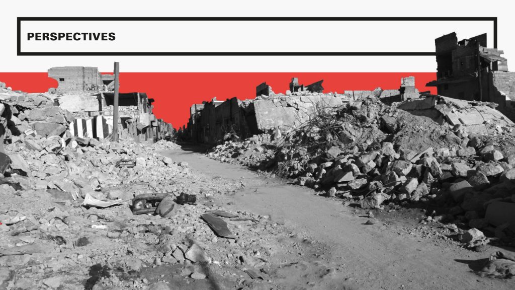
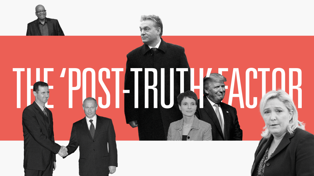
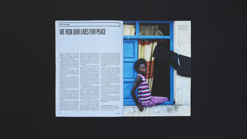
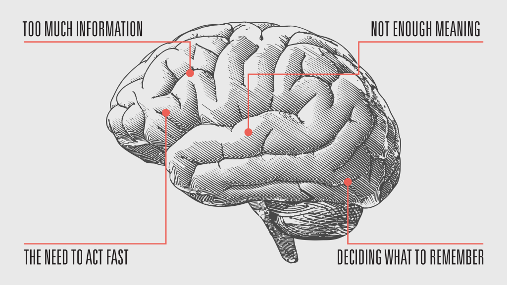
Inside, the design follows suit. Bursts of impactful photography, used sparingly, sit in contrast to longer sections of text and pages of minimal typographic-led designs. Illustrations and pull-out facts are used throughout to help convey key messages and put each issue’s theme in context.
We chose a dominant primary colour palette of black, white and vibrant red to present the content in an earnest but confrontational way. Occasional splashes of other colours and simple geometric shapes are also used infrequently to create stand out pages and allow for greater expression.
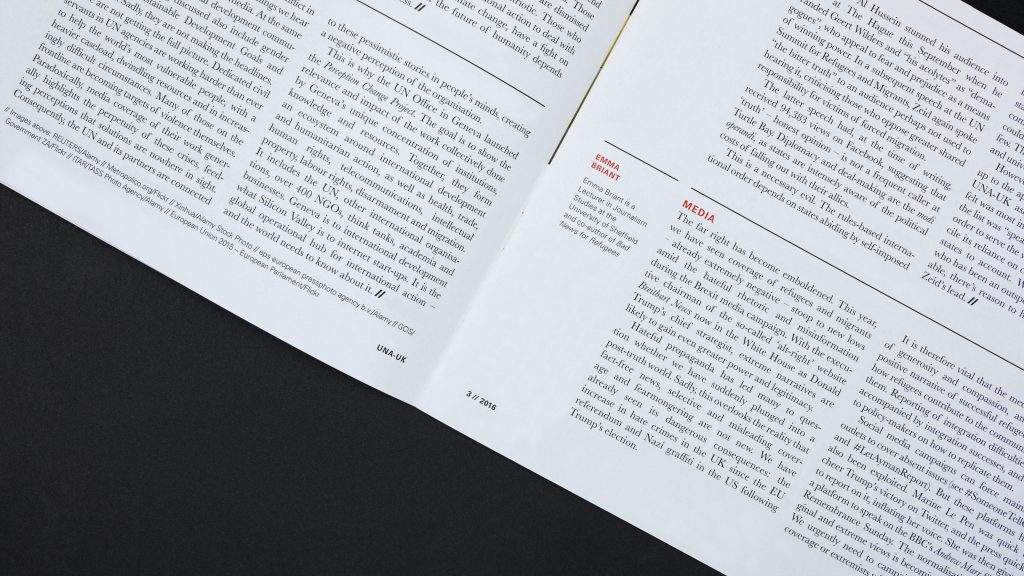
Typography plays a vital role in the redesign and is used to create drama and impact. A strong, condensed headline font gives a strong “call to action” feel, whilst the retention of Baskerville in the main text creates a sense of continuity with the previous design.
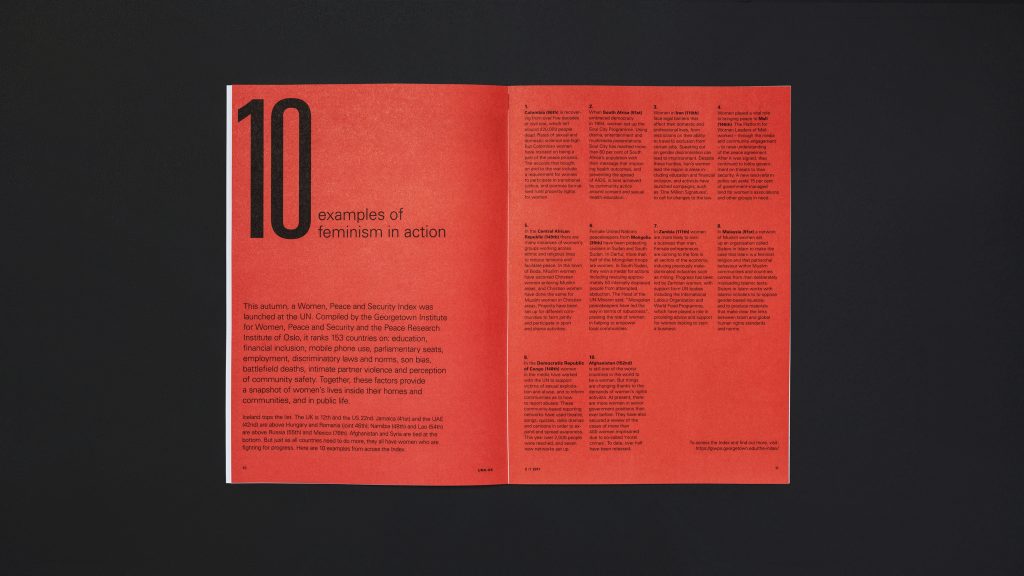
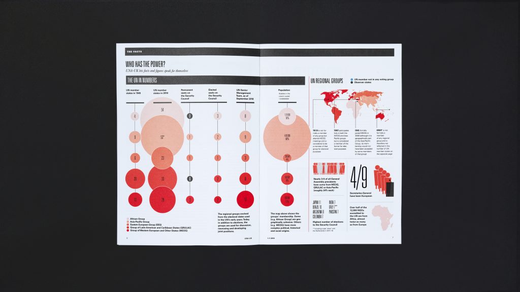
Each issue of the magazine features a bespoke infographic spread, bringing together key facts and figures in a simple and easy-to-understand way.
We continue to work with UNA-UK to ensure that each design lives up to the last. UNA-UK members remain informed not only of the work that the UN is doing, but also why it matters.


